Summary
The Summary tab provides a high-level health view of your automated testing over the selected time range, environment, and branches.
It surfaces volume, stability, and trend signals in one place so you can spot spikes, regressions, or noise before delving into details.
Test Run Volume
This chart shows daily runs, split by Passed tests (green) and Failed tests (red). Hover over a date to see exact counts. Use it to spot spikes, compare days, and correlate changes with deployments or data updates.
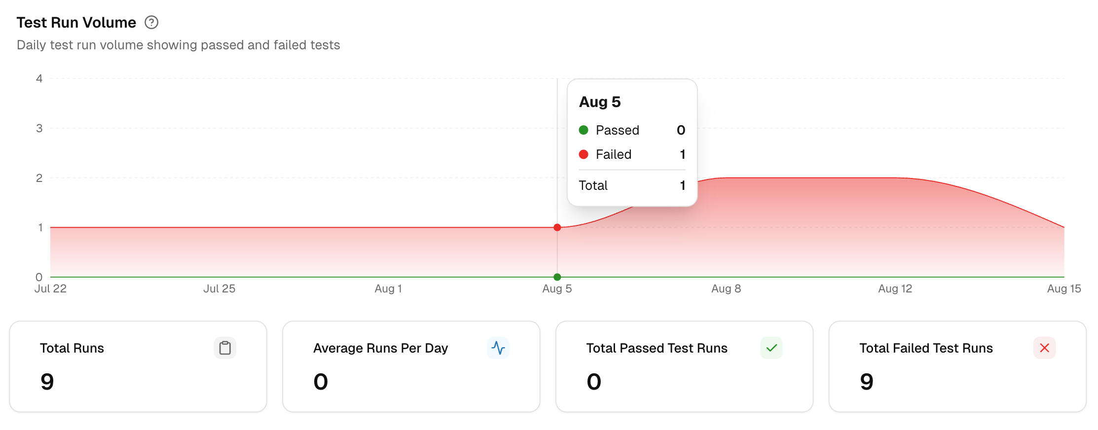
1. Total Runs
Counts all test runs in the selected time range and environment. Indicates test throughput for the period.
2. Average Runs per Day
Mean number of test runs per calendar day. Helps check CI cadence and scheduling consistency.
3. Total Passed Test Runs
Test Runs with zero failing tests. Track this to gauge build stability and confirm improvements after fixes.
4. Total Failed Test Runs
Test Runs with one or more failing tests. Use this to estimate the triage load and verify that the failure volume is trending downward.
Flakiness & Test Issues
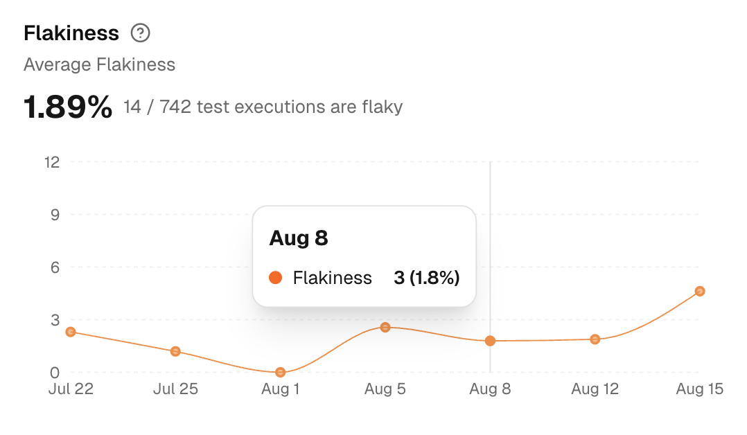
Measures the percentage of executions with inconsistent results for the same code (pass in one run, fail in another) and tracks problematic tests. This is a noise indicator.
A list of Flaky Tests on the right shows the name, spec file, and execution date.
- High flakiness means wasted triage and unreliable signals.
- Track the curve after fixes to confirm deflakes are effective.
New Failures
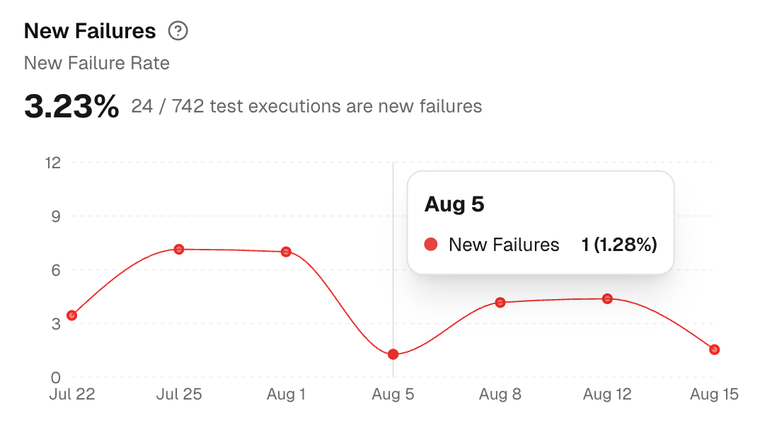
Measures the percentage of test executions that are failing for the first time compared to previous runs.
A list of the New Failures on the right shows the name, spec file, and execution date for every newly failed test.
Use it to detect regressions early:
- Spikes indicate recent changes that may have introduced defects or test failures.
- A flat or declining line indicates improved stability for newly added or recently touched areas.
Test Retry Trends
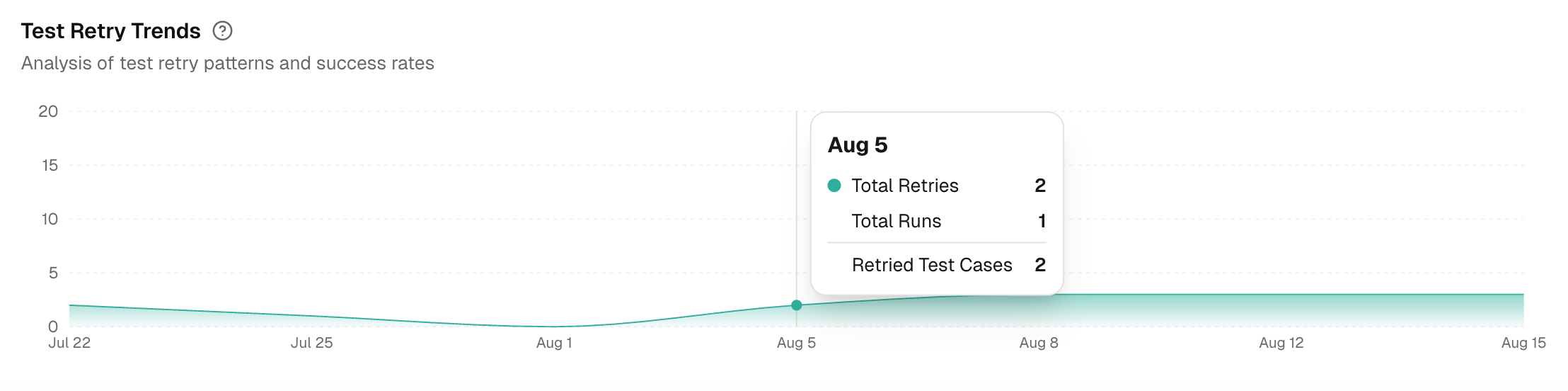
This chart analyzes your test-retry behavior over the selected time period, environment, and branch. A rising trend suggests your tests are becoming unstable or "flaky."
It shows three daily metrics:
- Total Retries: The number of times tests were re-run.
- Total Runs: The total number of test suites executed.
- Retried Test Cases: The number of unique tests that needed a retry.