Test Case
A focused view to understand how individual tests behave: which ones are fast or slow, how they trend, and where to invest tuning time. Use the top controls (Time range, Environment, Branches) to maintain a consistent scope while reviewing.
Key Metrics
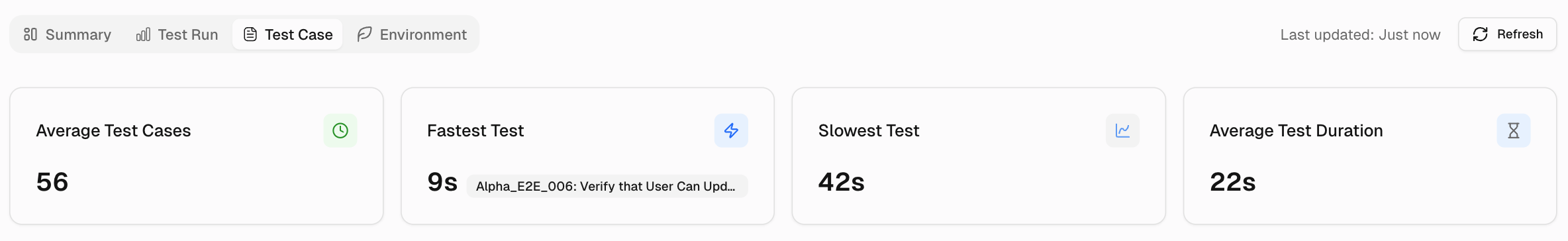
1. Average Test Cases
Shows the average number of test cases executed per run for the selected period. Use it to spot scope creep or missing coverage when the number shifts.
2. Fastest Test
Displays the shortest test duration with the test name, establishing a baseline for lightweight checks and smoke tests.
3. Slowest Test
Displays the longest single test duration, pointing to prime candidates for optimization or splitting to reduce cycle time.
4. Average Test Duration
Reports the mean time for one test case across the period. Track this metric to estimate total run time and verify performance improvements.
Slowest Test Cases
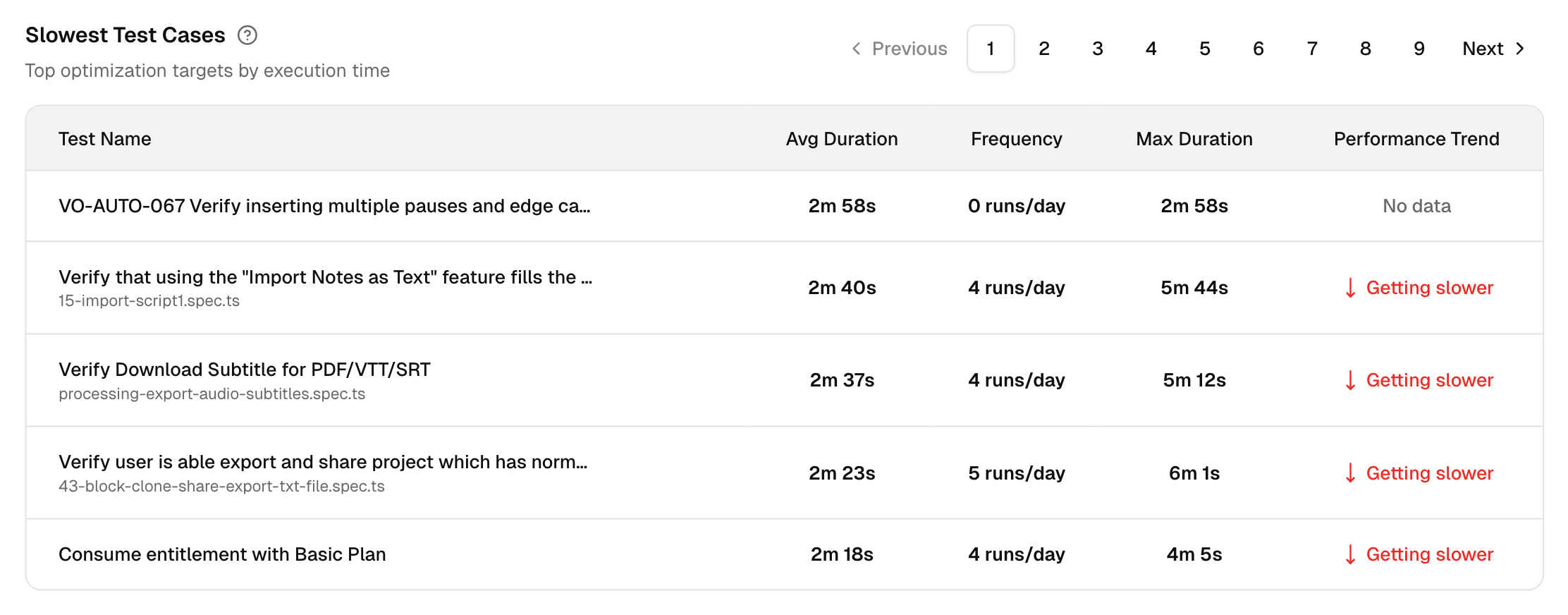
A table of optimization targets with columns for Test Name, Avg Duration, Frequency, Max Duration, and Performance Trend.
You can identify the tests that consume the most time, how often they run, the worst-case time, and whether they are getting slower, faster, or remain stable.
Click on a particular test case, and you will be directed to its Test Case Details page in TestDino.
Test Execution Performance
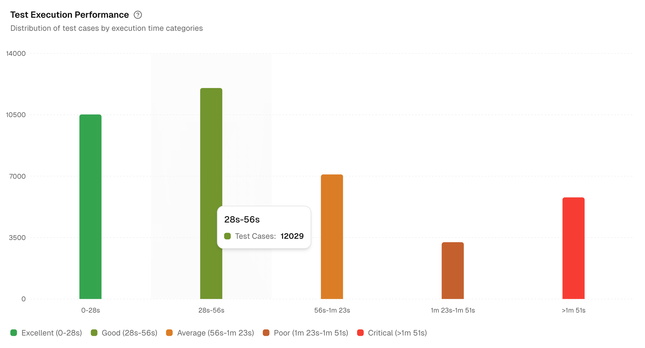
This chart categorizes test cases into performance bands to help you identify performance bottlenecks. The bands: Excellent, Good, Average, Poor, and Critical are defined dynamically based on the execution times of your project's test cases.
The view also lists all test cases categorized as ‘Poor’ and ‘Critical’ next to the chart. For each test case, you can view the following information: Test Case name, its corresponding Spec file, Average duration, and Total runs.
This provides a direct and actionable list of the most impactful tests to optimize first.
New Test Cases
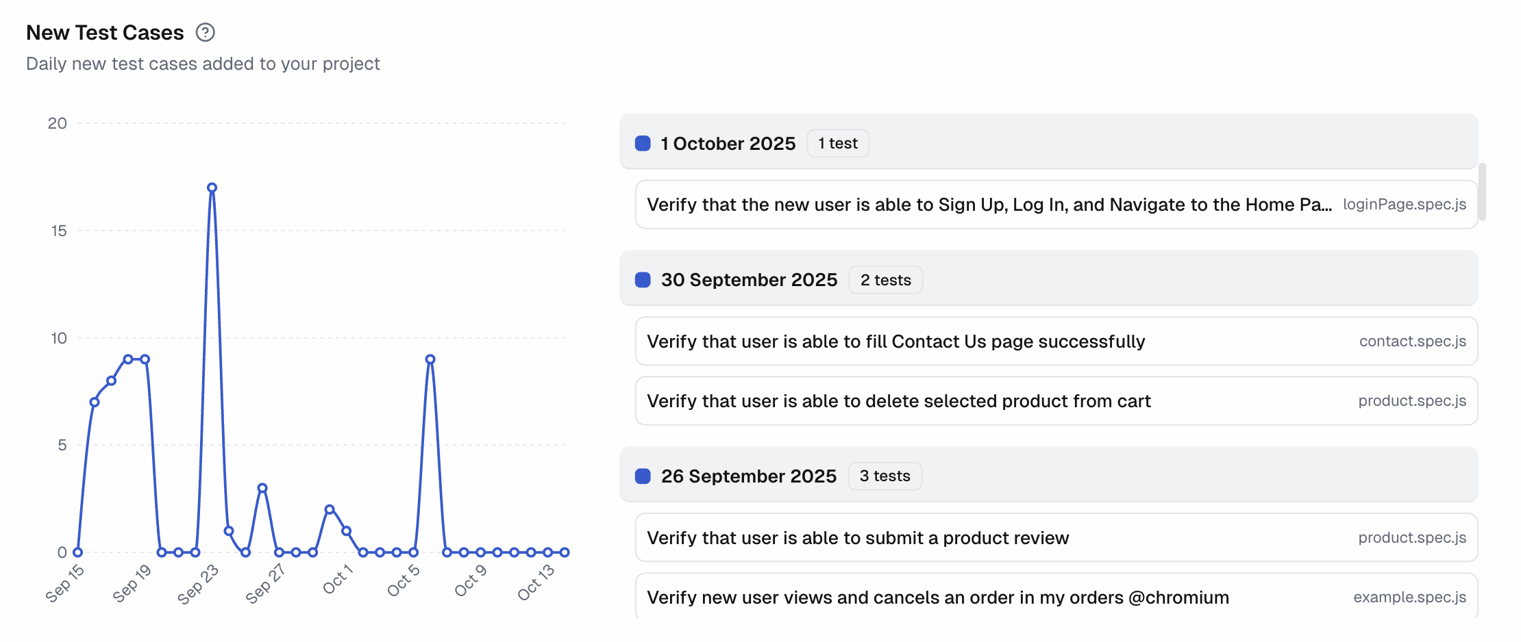
Line chart of new test cases added per day with the current-period average to provide a clear baseline for your team's test creation velocity.
This chart tracks the growth of your test suite, helping you monitor coverage expansion and correlate it with development cycles.
A list on the right shows the name, spec file, and execution date for every new test.
Hover over any point on the chart to see the exact count of new tests for that day.
Test Cases Pass/Fail History
Compare up to 10 tests side by side and see their changes over time. The view helps spot unstable tests, confirm fixes, and identify the day a regression started.
Selected Test Cases
- This area shows the current set of tests being compared.
- Each test is assigned a color that corresponds to its line on the trend chart.
- You can remove a test at any time to free up a slot for a new one.
Available Tests
- This is a searchable list of all test cases in your project that you can add to the comparison.
- When you select a test, it's added to the Selected Test Cases list until the 10-test limit is reached.
Pass/Fail Trends
- Plots a performance trend line for each selected test over the chosen time range.
- The y-axis represents the pass rate (0-100%), while the x-axis represents the date.
- Hovering over a point reveals a daily breakdown, including pass, fail, and flaky (passed on retry) counts.
- A color-coded legend matches each line to its test name, helping you track stability.