Test Run
A focused view of execution speed and efficiency for the selected time range, environment, and branches. It surfaces headline timing KPIs and trend charts so teams can track pipeline health and spot slowdowns early.
Metrics
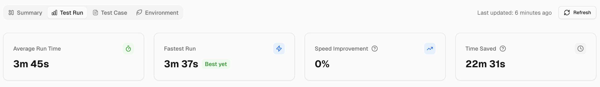
1. Average Run Time
Shows the mean duration of all test runs in scope. Indicates the typical time your pipeline requires to complete. Use it as a baseline for tracking daily performance.
2. Fastest Run
Displays the shortest single run duration in the selected window. The “Best yet” badge marks a new record relative to previous data in your project.
3. Speed Improvement
The percentage decrease in average run time compared to the previous period. A higher positive value means runs are faster than before.
Speed by Branch Performance
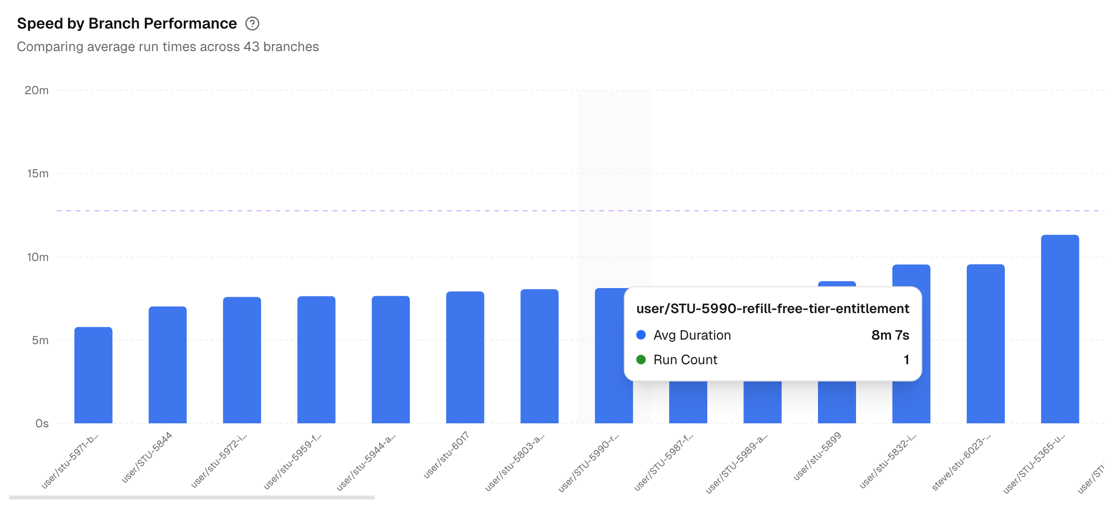
A column chart that compares average test run time across branches. A baseline helps you see which branches are above or below the target. Hover to view each branch’s average duration and test run count.
Test Execution Efficiency Trends
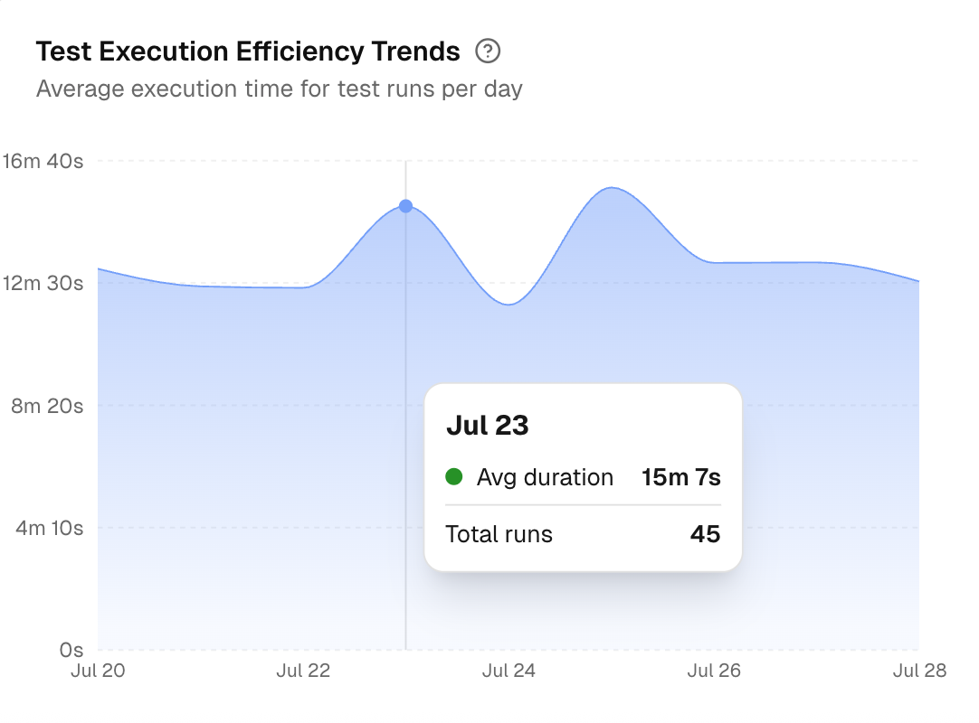
This is an area chart of average run duration per day. Highlights gradual drifts or sudden regressions in runtime. Hover to see the day’s average and test run count.
Test Run Speed Distribution
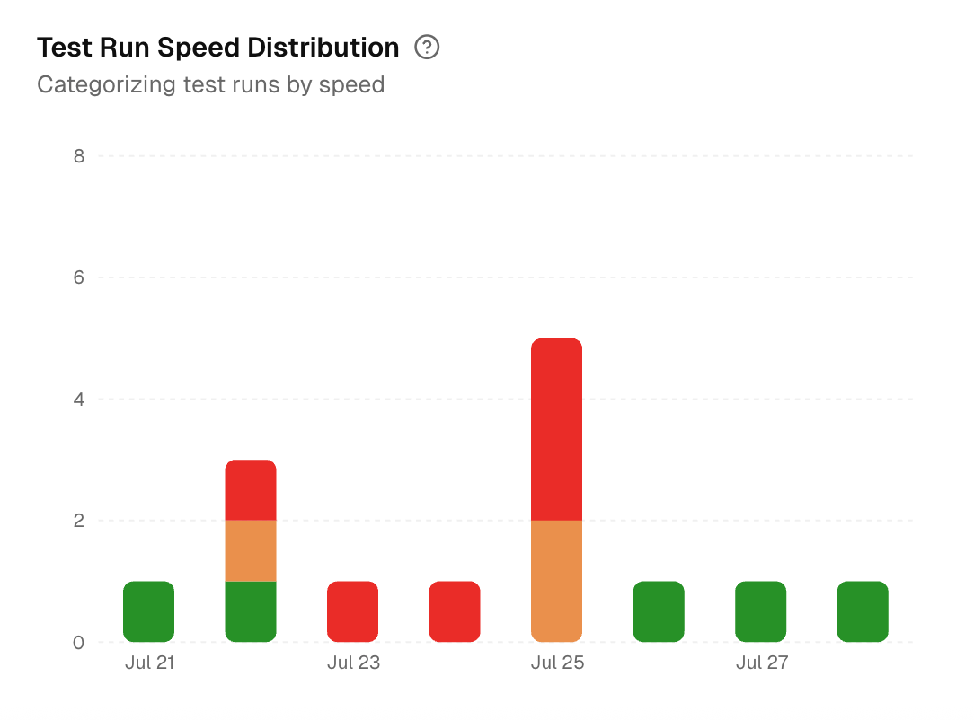
Stacked bars that bucket daily runs into Fast, Normal, and Slow groups based on duration thresholds. Reveals whether slow runs are isolated or common on a given day.