What you’ll learn
- How to compare pass rates across environments
- What branch and OS distribution reveal about coverage
- How to track pass rate and run volume trends per environment
Execution Results by Environment
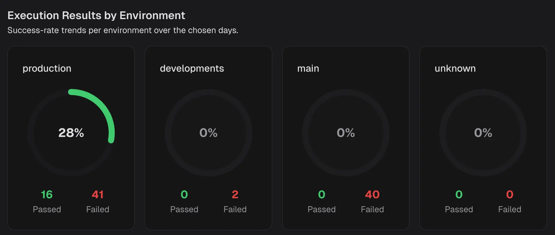 Shows the success rate per environment for the selected period. Each tile contains:
- Success rate - the percentage of passed executions in that environment.
- Passed and Failed counts, the raw numbers behind the percentage.
Environment Analysis
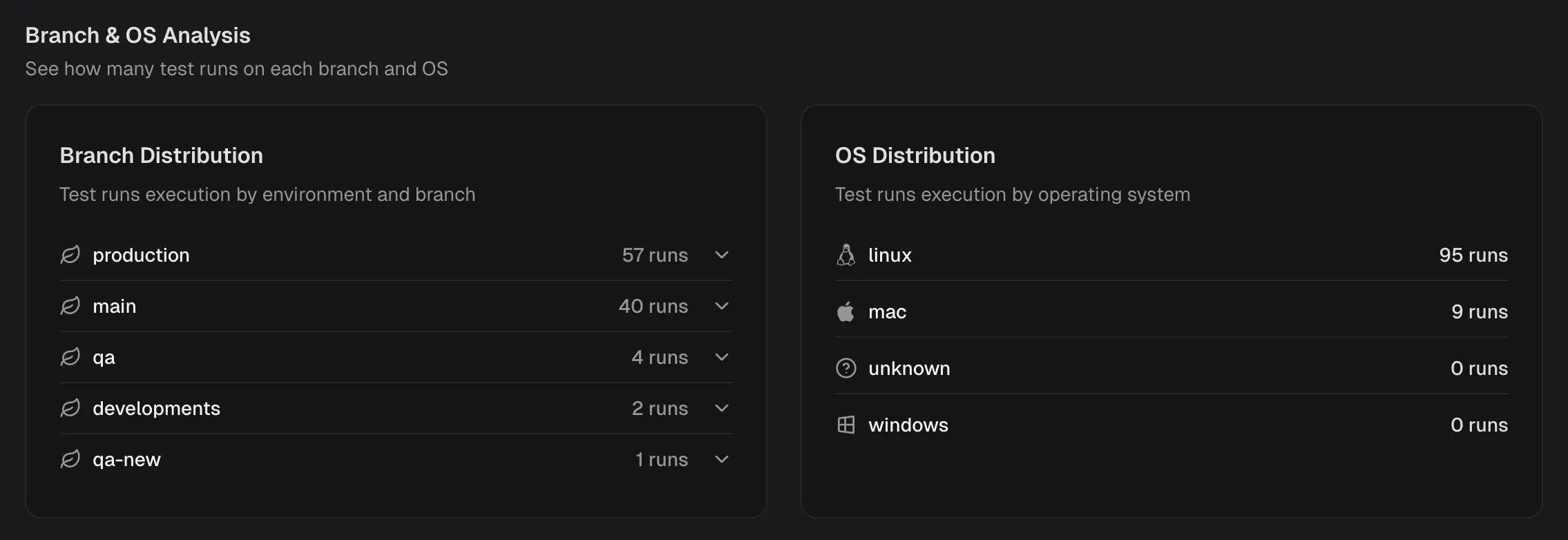
Branch Distribution
Lists how many test runs were executed on each branch in the selected scope. Identify which branches drive the majority of the signal, catch branches that are not being exercised, and balance CI usage across workstreams.OS Distribution
Lists how many test runs were executed on each operating system. Check platform coverage at a glance, detect skew toward a single OS, and plan additional runs where platform risk is higher.Pass Rate Trends
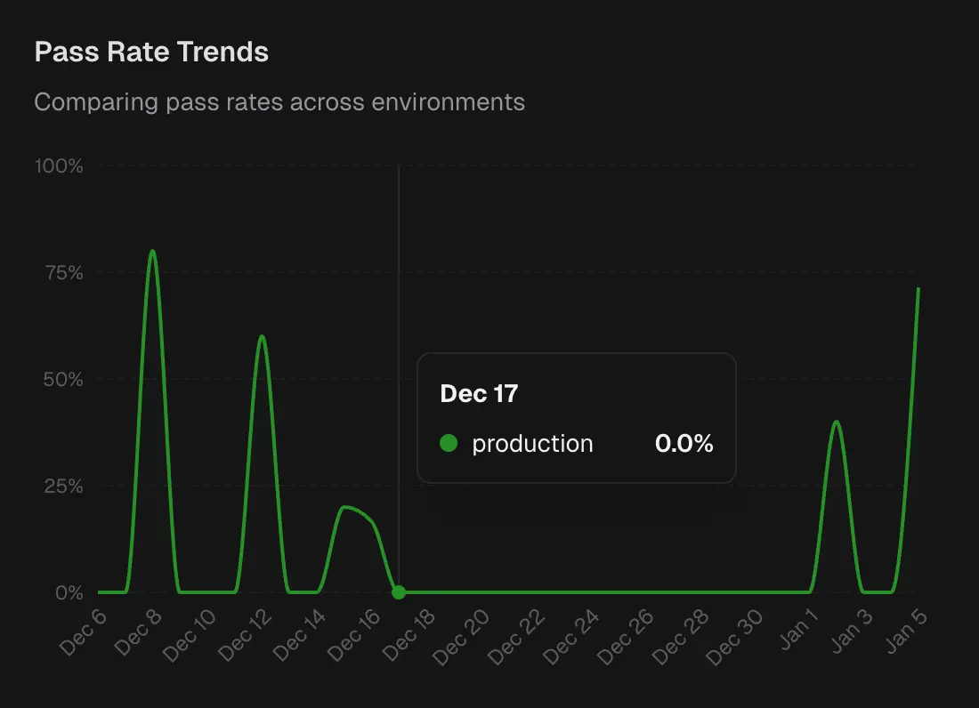 Time-series chart of pass rate by environment. Each line represents an environment.
Spot the day an environment’s stability dropped, correlate with deployments or infra changes, and verify that a fix improved the trend.
Time-series chart of pass rate by environment. Each line represents an environment.
Spot the day an environment’s stability dropped, correlate with deployments or infra changes, and verify that a fix improved the trend.
Test Run Volume
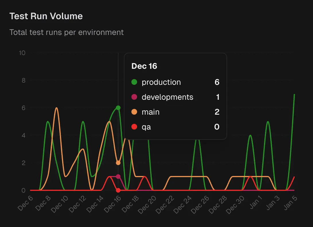 Time-series chart of total runs per environment.
Helps you distinguish signal from noise. Large changes in pass rate after only a few test runs indicate a lack of confidence. Volume also reveals where CI capacity is used and where coverage is thin.
Time-series chart of total runs per environment.
Helps you distinguish signal from noise. Large changes in pass rate after only a few test runs indicate a lack of confidence. Volume also reveals where CI capacity is used and where coverage is thin.