

Quick Reference
Time window
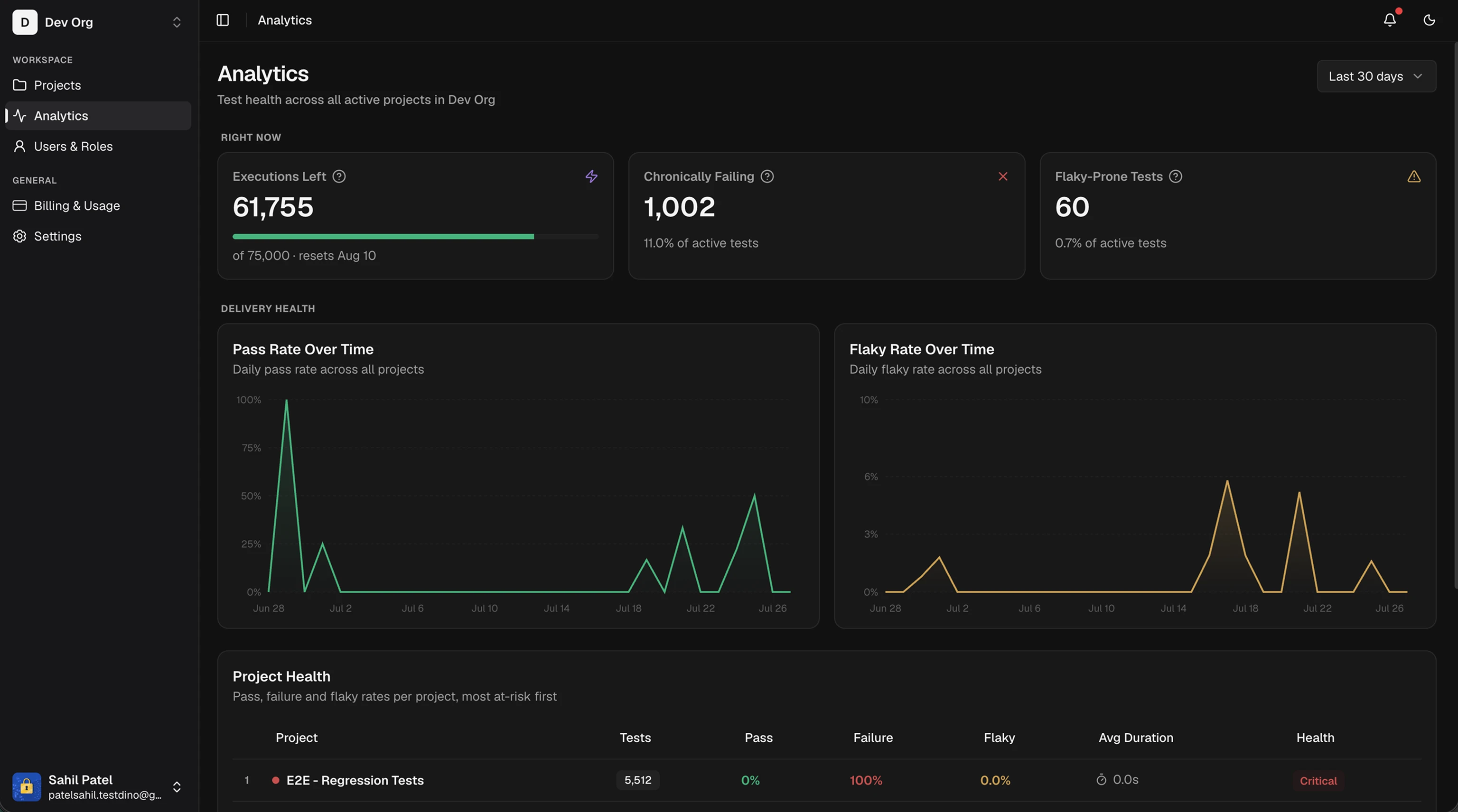
A single time-period control in the header scopes the whole page. Pick Last 7 days, Last 30 days (default), or Last 90 days. The page always covers every project you can access, with no per-project filter.Right now
3 cards summarize current risk and remaining usage.
The chronic and flaky counts cover the selected time window.
Delivery health
2 daily trend charts span the selected window, with 1 point per calendar day.
Trends appear once you have at least 2 days of runs.
Project health
A table ranks projects by risk, most at-risk first. Each row is 1 project.
The Health badge follows fixed thresholds:
The table sorts by risk automatically. Column headers are not clickable.
Plan and capacity
3 cards track usage against your plan.
The Projects and Seats bars turn amber when you are at or over your plan limit, which is a prompt to upgrade.
CI (continuous integration) time and cost analytics are coming. They will estimate your total CI minutes and the share spent on flaky reruns.
Related
Project Analytics
Build a custom dashboard for a single project
Billing & Usage
Track executions, seats, and plan limits
Projects
Create and manage projects in your org
Flaky Tests
Detect and fix flaky tests